![]()
![]()
A beginner’s guide
While this website is not a blog, I want to give you guys some quick advice how to deal with fonts in your Creative Cloud Apps.
So, you just bought a nice font at your trusted font distributor platform? Let’s get into this:
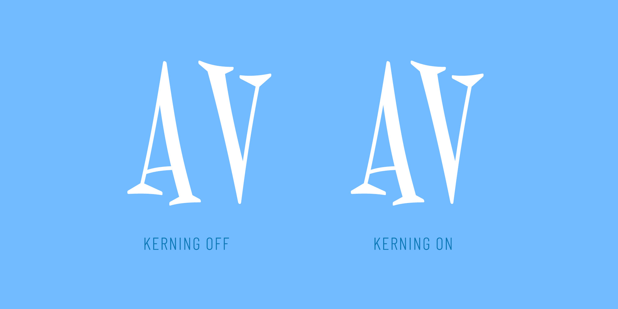
'What is Kerning?', I hear you ask. Kerning values are implemented by font designers to balance the distance between a pair of glyphs. For instance, there's a too wide gap between V and A in almost every font out there. This is where Kerning comes in to make things look more smoothly.
By opening the character panel in your Adobe Software and setting Kerning to 'metrics', you can make use of this feature. When choosing 'optical' instead, the software will estimate kerning values itself.
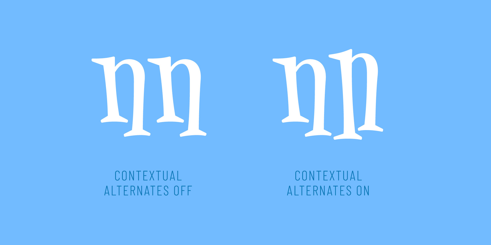
Contextual Alternates are often used as problem solvers, e.g. when a special version of a glyph is needed to avoid crashes with certain other glyphs. Plus, this feature can also be useful to prevent repetition in handwritten and other decorative fonts. Basically, the concept is: 'if there's X and Y, replace Y by an alternative Y'.
To find out if your font has some alternates included, just open your character panel and turn on the feature (the icon looks like a handwritten o).
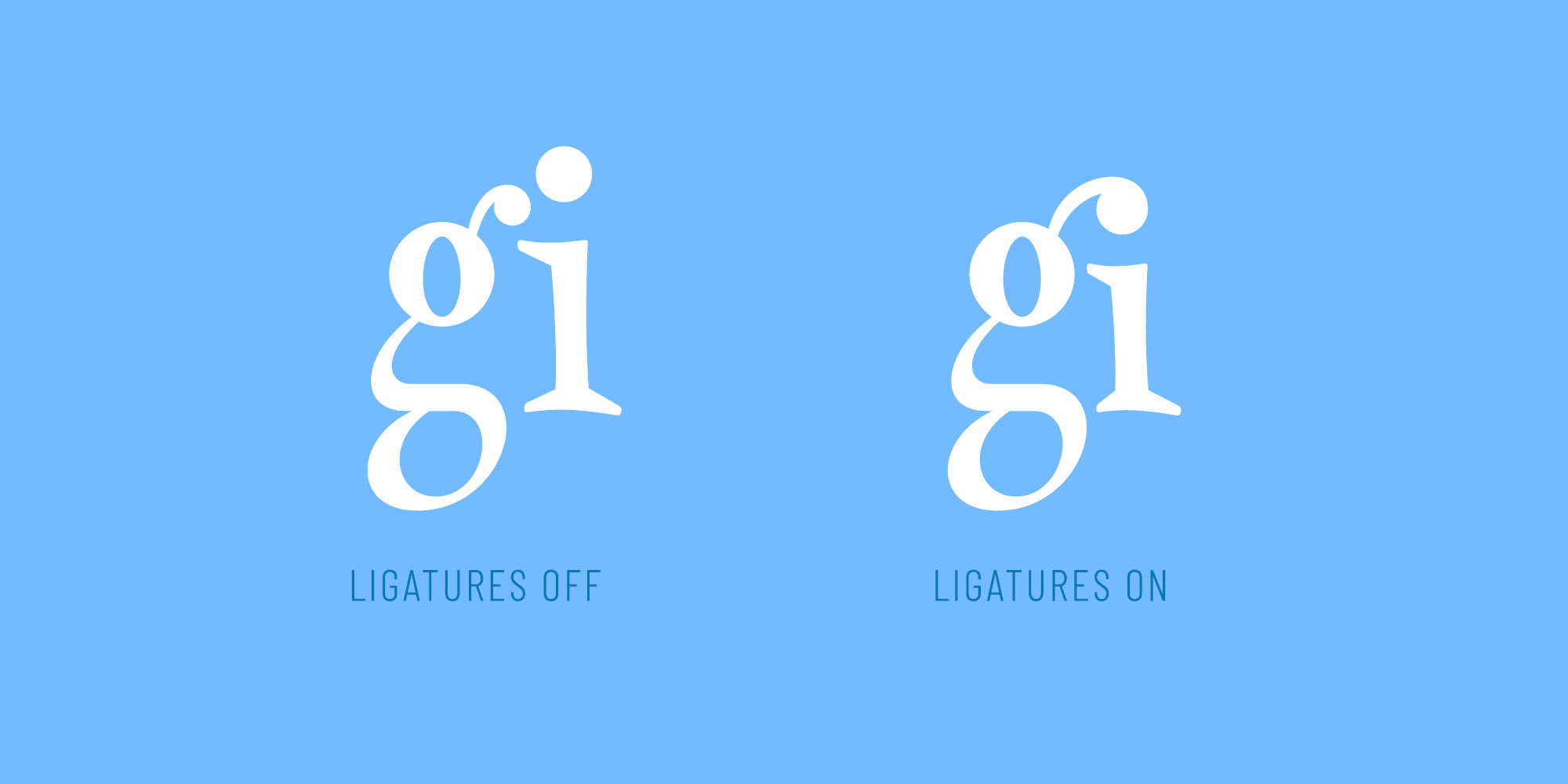
A Ligature is one single glyph replacing two or more glyphs. For instance, the most common ligature is a smoothly designed combination of 'f' and 'i', because the upper part of 'f' is crashing with the 'i'-dot in a lot of fonts out there. To make sure these Standard Ligatures are on, watch out for the 'fi' icon in the character panel.
But there's more: Discretionary Ligatures go beyond these standard combinations and are often used in a more creative and sometimes funny way by type designers. To turn on Discretionary Ligatures as well, click on the 'st' icon.
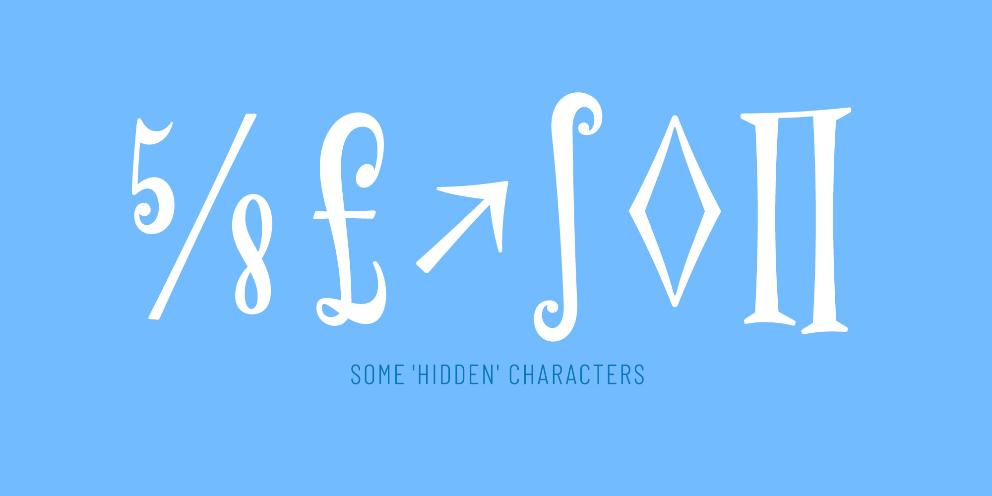
Professional fonts come with hundreds, sometimes thousands or even ten thousands (!) of glyphs. When you want to use a glyph which is not available on your keyboard, it's a good idea to open the glyphs panel in your Adobe app, which will give you a nice overview about all the glyphs in your font. Alternatively, you can search the desired character in the web and copy-and-paste it into your design. However, if it's not available in your font, the character will likely be shown in a basic system font instead.
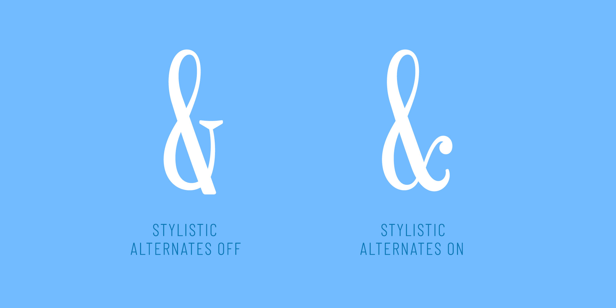
In some fonts, you can find alternate characters to create a slightly different look and feeling. These are often funny to use and worth exploring. In the character panel, just tap the icon with the double-a and the arrow to try Stylistic Alternates. Or, for a more detailed approach, click on the burger menu in the upper right, then 'Opentype' and 'Stylistic Sets'. Sets that are available in your font have no brackets around its names, so you can try them by just clicking.
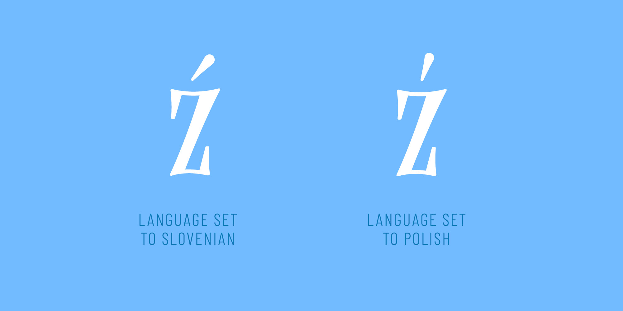
Working internationally? When creating a design in a foreign language, it's a good idea to tell Adobe which language you are using by selecting it in the character panel. Not only will hyphenation start to work correctly, there are also a couple of 'local rules' in some languages which eventually can be handled by your font. For instance, an accent acute is not designed identically in the polish and the slovenian language.
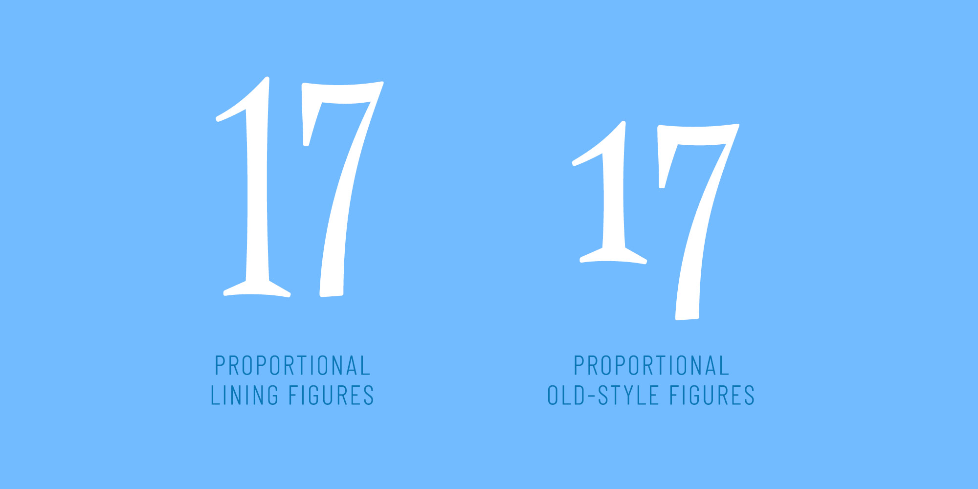
While most people just use the default figures in fonts, it's a good idea to watch out for some different figure sets in your favorite creative cloud app. In the character panel, hit the burger menu, then click 'Opentype' and pay attention to the two sections at the bottom. For instance, 'Proportional Oldstyle' figures attempt to replicate the look of lowercase characters. This is pretty useful if you want to make a number inside a text less prominent.
In Photoshop, where typography is not a focus, figure settings are 'hidden' in the text options of the properties panel.
Although not every font out there has all of these features covered and others offer far more features than the ones shown in this article, I hope you now have an idea how to start dealing with these hidden extras inside your fonts.
Happy creating! 🚀